Looking For Something ?

Google

Thursday, July 26, 2007

Some Facts About Downloading Linux


Linux, together with a set of GNU programs, is an operating system. That is, Linux is not a single program or a suite of tools. Most "versions" of Linux, known as "distributions", are available to download free of charge. However, there are some things you should know about downloading and installing Linux:

First, you don't have to actually install Linux in your hard disk to use the Linux operating system. There exist several "versions" of Linux that can be downloaded and burned to a CD. These variants of the Linux operating system, known as "Live CD" versions, will boot Linux directly from the CD on systems that are capable of doing this. (most PCs manufactured in the last 7 to 8 years will allow this). Memory requirements vary, so please consult our list of Live CD distributions on our distributions page (choose the option 'Live CD' from the 'Category' menu). There are several popular Live CD distributions, such as MEPIS, Knoppix and Slax. Most major Linux distributors (SUSE, Mandriva, Ubuntu) also offer Live CD versions of their products.

If you're interested in running Linux indefinitely or permanently, you can also download versions designed to be installed on your hard disk. Here is some information you should know.

  • You should have a high-speed Internet connection (T3, T1, xDSL, cable modem). Trying to download a major vendor's version of Linux will most likely be a frustrating experience with a dial-up modem connection.
  • You'll need the ISO images or a DVD image for the distribution you want to download which you must then copy or "burn" into a CD or DVD.
  • If you already run another operating system, you must re-partition your hard disk in order to install a "standard" Linux distribution.
  • When you download Linux from the Internet. You are not entitled to that particular distributor's technical support. You will have to look for the documentation that you need in order to resolve any problems you might run into or seek appropriate help on websites or in other Internet forums.

In other words, if you don't have a high-speed connection to Internet or a drive that writes to blank CDs or DVDs, then downloading is probably not the best way for you to get a full-featured Linux distribution. You can, though, depending on your location, get Linux free in magazines or from retailers that will sell you a distribution on one or more CDs at very low cost. Distributions obtained in this way do not usually include documentation or support. There are also many books that include a Linux distribution.

If you don't know how to partition a hard disk or you have very little experience with installing and maintaining an operating system, you can still install Linux fairly easily by purchasing a boxed set. In this case, the cost of Linux system increases, but on the other hand, you will be provided full documentation, step by step installation instructions and in many cases free technical support for up to 90 days by phone or e-mail.

If you're still not quite sure you want to make the leap to Linux, you may want to at least get a feel for how it looks. This can be as simple as using your favorite Internet browser. Both OSDir.com and Linuxquestions.org have screenshot galleries that will give you an idea of the look and feel of many Linux distributions. This can be helpful when choosing which version of Linux is right for you.

Regardless of the way in which you obtain a Linux distribution, we at Linux Online feel that switching to Linux will be a positive experience. You will see your knowledge of computing increase at the same time as your productivity. You will be able to do much more with your computer and at a fraction of the cost of proprietary operating systems.

For more information, we also recommend you read our Linux Online FAQ (Frequently Asked Questions) and our page: So You Want to Use Linux? which talks about Linux migration.
Wednesday, July 18, 2007

Creating a 5-minute Website

If you find that you are totally unable to design a nice-looking website, no matter what you do, you'll find this five-minute website tutorial to be invaluable. I learned by imitating the websites of the professionals, and came up with this nice website design formula.

This tutorial goes through the steps of making a left-oriented website.

Choosing a background for your website -

White website background
(reputable, mainstream) A white website background should almost always be used on a company website, or a site that is trying to sell something. The "white" theme can also be done with a navy blue background, and white text.

Black website background
(cool, different) A black website background should be used for any website that's even slightly non-corporate - games websites, adult websites, personal websites. If your website is a bit different, use black.

Graphical website background
(natural, real)


Making your website background graphical (e.g. by tiling), is dangerous, and rarely looks good. A very faint photo or a well-done watermark is okay. I had to tone down the background on my old website several times to get it right.

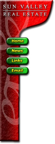
1 – Setting up the menu area

Your website should always start in Photoshop, not your web page editor.

Make a new 500x400 pixel image.

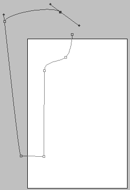
Zoom out and use the Freeform Pen tool to make an appropriate shape for a website menu. Remember to hold Ctrl whenever you want to move your points around, or drag their "arms". Make sure you have the "Paths" option at the top left of the screen selected. (You must zoom out or maximise the little window you're working in, otherwise you won't be able to drag your points into the grey area.)

Turn it into a selection. (Right click on it and choose "Make Selection".)

Make sure that your points make almost a complete circuit, as the first and last points will connect up when you turn the path into a selection.

2 – Designing the menu

Create a new layer.

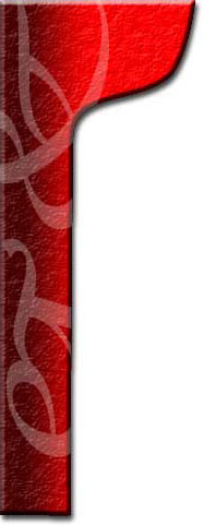
Fill the selected area with a left-right gradient of a colour and a darker shade of that colour. (I used red and dark red.)

Right-click the layer in the layers list, and choose "Blending Options" (Adobe Photoshop 6.0 & 7.0) or "Effects" (Adobe Photoshop 5). Give the area a shadow, bevelling, contour, and a texture (I used Carpet here).

3 – The watermark

To create a watermark (lightened area), use the Wingdings font, and type in "jk". It should come out as two swirly symbols.

Press Ctrl+T to rotate them, then make them into a watermark by changing them to an Overlay layer.

If your watermark extends over the edge of your menu area, just right-click it in the Layers list, and Rasterize or Render it, to make it editable. Then Ctrl+Click on your red menu layer, click Select > Inverse, and press Delete, to delete the unwanted part.

4 – Making a logo

The bulbous area at the tip is where the website's logo goes.

Use Times New Roman font here, and put some appropriate text in.

The easiest way to put the horizontal line in is by just typing underscores. ( __ )

GRight-click each of these layers, and choose Blending Options (Photoshop 6.0 and 7.0) or Effects (Photoshop 5.)

Give each of these layers a 0.5 pixel black Strok (outline), a Drop Shadow, and a Bevel.

If a black outline of one pixel is still too much, just make the outline 50% opacity, and it will look like it's half as thick.


5 – Making some buttons

Create a new layer.

Use the Shape Tool to put in a rounded rectangle. (Select the little square button at the top left that says "create new work path"). Create the shape, and then right-click it and convert it to a selection. (This step is Adobe Photoshop 6.0 and 7.0 only - just use a rectangle in Adobe Photoshop 5.0)

Put another light-to-dark gradient across the shape (I've used green), and then give them the usual bevel/contour, texture, stroke, and shadow.

Give the button some text (I've used bold Tahoma), of a new colour (I've used yellow), and give it the usual effects, but without the texture.

6 – Adding a picture

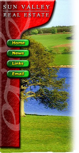
The final touch, which adds a nice effect, is to put a picture of something relevant in behind the menu. You can find stock photography easily on the web.

Use the Clone stamp tool to extend the top and bottom of the photo if it's not big enough.

While holding shift, run a white airbrush along the right side of the image.

Don't worry about the bottom of the image for now.

When you've finished doing any website design, always select any non-picture elements (e.g. the menu bar, header text, buttons, and button text) and press Ctrl+U to colour-shift them. Play around with the sliders until you like the colours. (I haven't done this here, because I already knew which colours would look best. :)

7 – Creating a "sliver"

A sliver is what I call a thin slice of an image that can be repeated indefinitely on your website, to fill up an area of any size.

Save your work here, and do not save it again from this point, as the image will be flattened, and you want to keep your layers for future work.

This step can also be done easily with the Slice Tool, but for simplicity, it has been omitted here.

Select an area towards the bottom of the image, about a centimetre tall, and as wide as your image.

This area should not have any watermark on it, or any outstanding features in the photo.

Click Layer > Flatten Image, then Image > Crop, to remove everything but the selection. (If you don't flatten the image, it will apply the bevel to the top and bottom edges of your sliver, which is not what you want.)

Click File > Save for Web, and choose Jpeg, Quality 60.

On the History Palette, undo the Crop, but not the flattening.

Select the area of your menu, and click Image > Crop. This selection should be exactly the same width as your sliver.

Click File > Save for Web, and choose Jpeg, Quality 60 again.

8 – Table layout

In your web page editor, make a table with two columns.

Set the width of the left column width to be equal to the width of your menu image, and set the right column to be around 500 pixels wide. Make the width of the whole table equal to the sum of these two numbers.

Set the background of your left cell to be the sliver image. Then insert the menu image into that cell. Depending on your web page editor, use Hotspots or an Image Map to turn the buttons into links.

To finish up, some words about text...

Obviously, the body text of the page should be black, but what about the headings?

Scroll up and look at the image. The aim is to balance the primary colours - red, blue and green. Which colour is there the least of?

The red menu bar, and the green buttons and grass are each more prevalent than the blue water, so the best colour for the text headers on the page is blue. (Always use a dark shade of that colour when on a white background.)

Mandrake 10.0 Release


Mandrake Linux 10.0-preview edition pretty much defines the shape of things to come in Linux land in 2004. With Kernel 2.6, KDE 3.2 beta and XFree86 4.4 beta, it doesn't leave much to be desired. This article refers to cooker snapshot as of December 31, 2003. Please note that this release is not a beta release. This is not even an alpha release. Its just something put together to show what we can expect from Mandrake 10.0. This release comes on only two CDs so some of the packages are missing. And as there are bound to be lot of bugs in this kind of release, I'll be concentrating more on the usability aspect. So let's see if it is worth drooling over.